Illustration . Packaging . Labels . Layouts . Typography . Brand Identity .
Illustration . Packaging . Labels . Layouts . Typography . Brand Identity .
Illustration . Packaging . Labels . Layouts . Typography . Brand Identity .
Illustration . Packaging . Labels . Layouts . Typography . Brand Identity . Illustration . Packaging . Labels . Layouts . Typography . Brand Identity . Illustration . Packaging . Labels . Layouts . Typography . Brand Identity .
Consumer focused approach,
personalized designs, every time.
Introducing: Independent Graphic Design Services
I am here to offer you precisely what you need—effective and efficient design solutions that prioritize your objectives while keeping the consumer in mind.
About me
Hi I’m Tommi! Born and raised in Sydney Australia, recently moved to Finland with my fiance and adorable little Dachshund. I have a background in hairdressing, hospitality and design, I’m well versed in customer service and consumer needs. With experience seeing from all sides, my approach fresh, relatable, and effective.
Over the last few years I have developed an intriguing design aesthetic that shows through my work and other creations. What I enjoy most about Graphic Design are the challenges of pushing the boundaries of a brief and creating something a little left field. My interests are layout, illustration, typography and package/label design.
In my spare time you’ll find me painting, playing piano, roller-blading or sitting with a cup of coffee, curled up with my dog, reading the latest issue of Frankie magazine.
Previous work
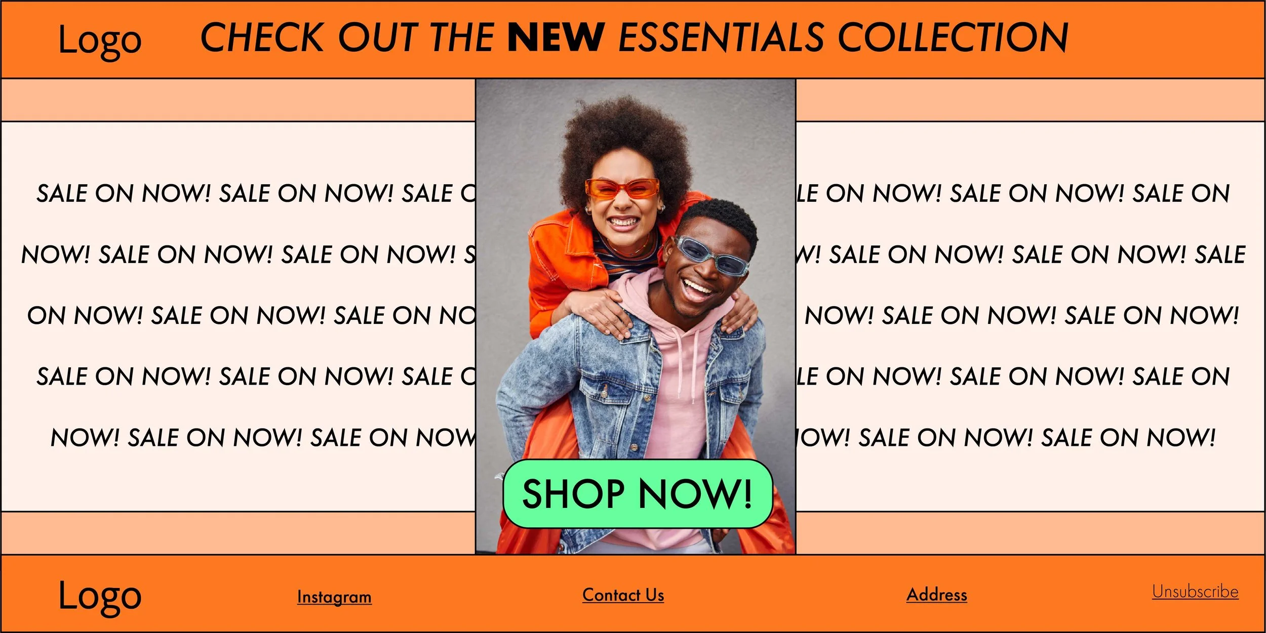
Promotional EDM For Glasses: The Essentials Collection
Promotional EDM for a glasses company. The objective of grabbing the viewers attention immediately and encouraging clicks through to the new collection. The colours are bold, warm and inviting, with a happy image which evokes emotion, connecting the brand to the viewer. With the CTA button being green,
large and centred, makes it a positive experience for the viewer to click through to the collection. Repetition is also known to be effective in marketing as it has a sense of rythym and consistency, making the design more memorable. An Italic font is used for most of the type, giving a feeling of forward flow and an emphasis on playfulness.

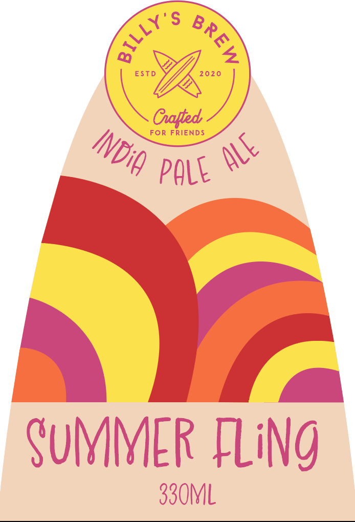

Design a beer label for an India Pale Ale named ‘Summer Fling’
‘Billy’s Brew’ a mock-up brand established in Noosa, QLD. In this brief I had to design a label for a beer named ‘Summer Fling’, it was a tropical fruit flavoured IPA. My idea was to produce an abstract illustration
to encapsulate the curves of the waves at Noosa beach. Using colours of summer and tropical fruits to tie in the flavour and the origin of the brand.

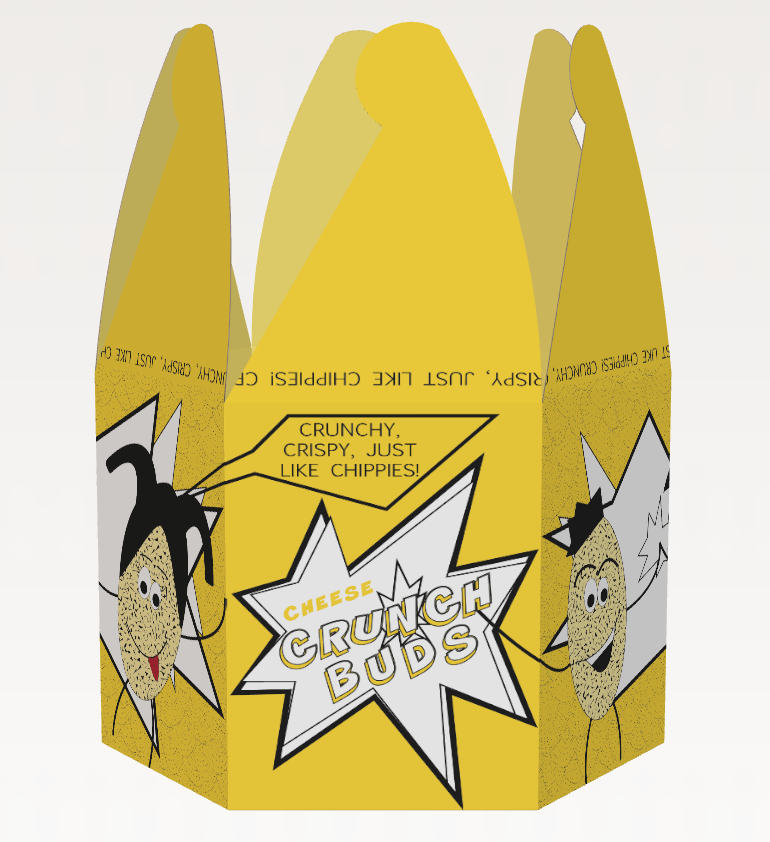

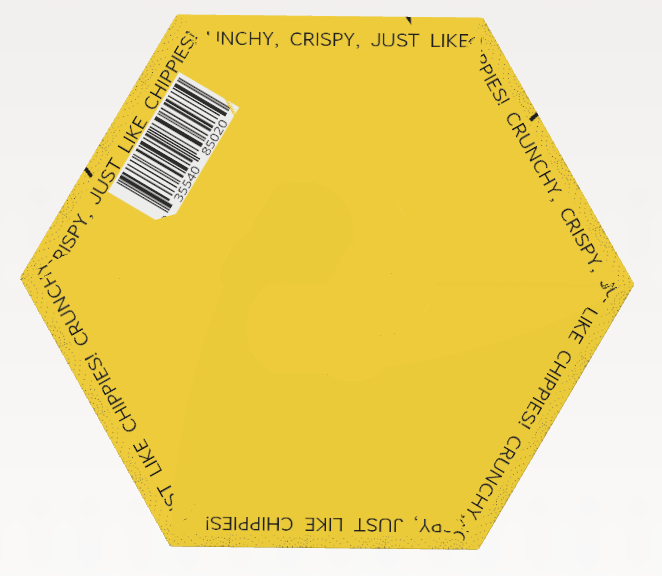
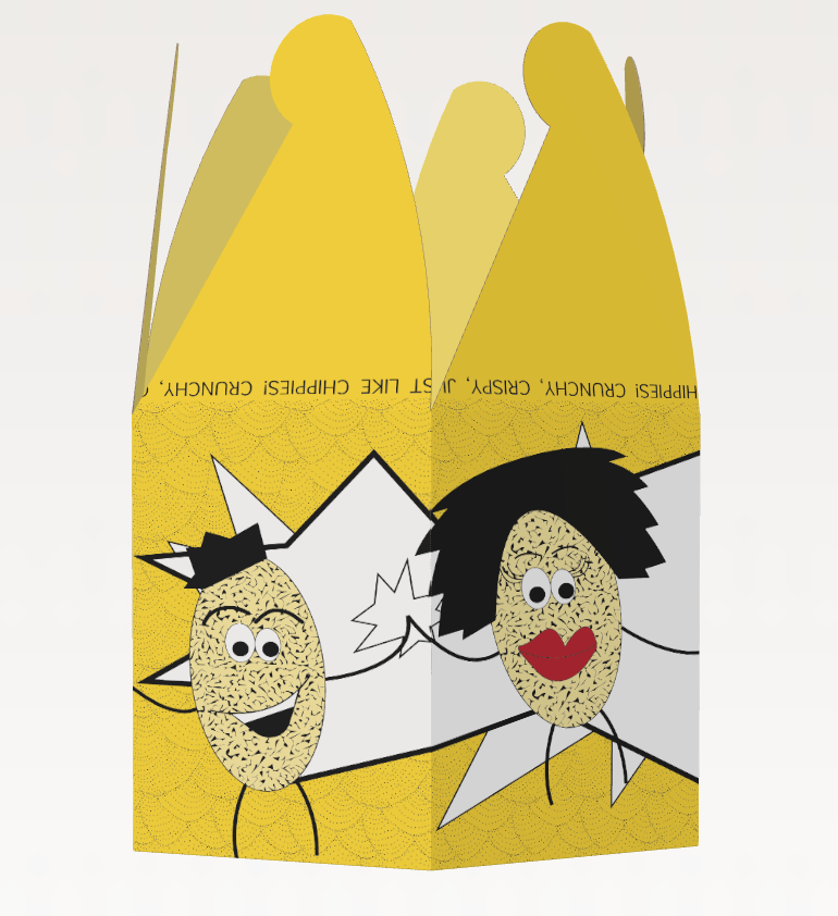


Redesign an existing brand and packaging
For this brief, I chose to redesign Pringles packaging. My concerns for current packaging were that the packet is not wide enough for most peoples hands. It’s also hard to recycle because of the mixed materials used. The graphics are okay but could be a little more interesting to grab the attention of consumers. My design solved the previous issues by having
a bright colour to stand out on supermarket shelves, bold graphics and text. The shape was changed to be able to fit your hand in the packet easily. The name was changed to ‘Crunch Buds’. The brand identity is stronger by having multiple characters throughout the design, enabling more versatility in advertising and recognition of the brand.
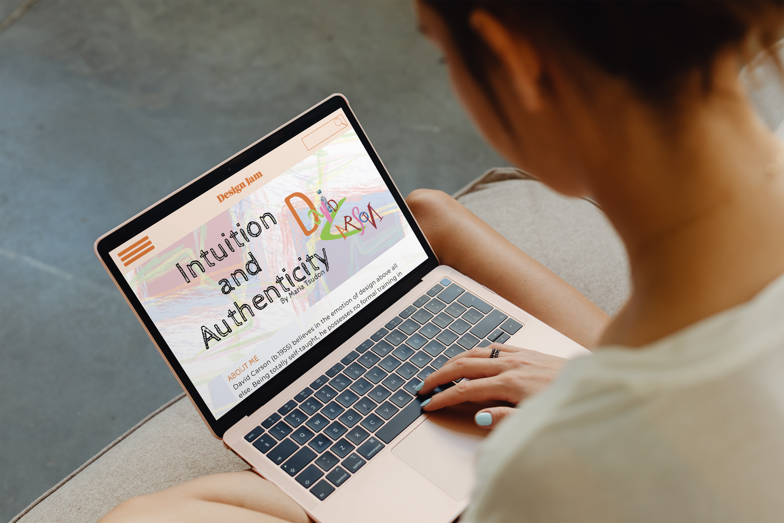


Create a website layout with effective typographic skills, capturing David Carsons aesthetic.
Included in the brief was body copy about David Carson and imagery of some of his work. The layout and any other assets we would like to add were up to the designer. We were to align the content in an engaging manner, to stimulate the reader and have an effortless flow through scrolling. I created a
grid structure to ensure my layout displayed effective visual language. The background illustrations and title were created in illustrator, to compliment what kind of person David Carson is and the work he creates.
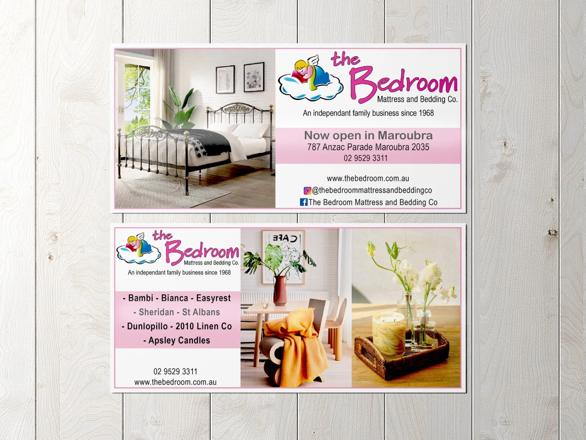
Create a flyer for The Bedroom Shop; design for letterbox drops.
The flyer had to represent the family business feel whilst still looking professional and upmarket, though showcase the wide range of products. As it was a design brief for my family business, I had free rein with the design, the only assets were the logo, shop
location and contact information. It being a small flyer, I used bright and light imagery to my advantage and a small amount of body copy. It is a visually balanced design and with the intended use being in letterboxes, it will stand out.
Skills & Services
General Design
Content design
UI/UX Design
Package Design
Brand Identity
Illustration
Typography
Colour theory
Advertising
Posters
Flyers
Signage
Merchandise
Social Media
Data & Analytics
Research & reporting
SWOT Analysis
Customer Journey & Empathy Mapping